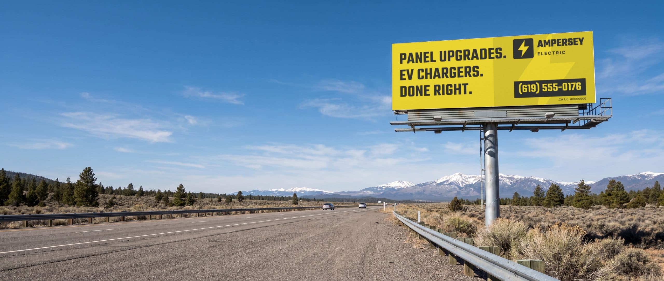
What makes a good billboard design?
A good billboard is read in seconds by someone doing something else. Lamar's design team puts typical exposure at four to five seconds (seller), because the audience is usually moving. Blue Line Media gives the same 4 to 5 second read time (seller). Everything about billboard design follows from that window.
The industry's own guides agree on five rules. They come from OAAA, the outdoor industry's trade group, and from the creative guides the big billboard companies publish for their customers:
- One message. One idea per board. Not your whole menu of services.
- About seven words. A common rule of thumb, published by OAAA and by Lamar, Clear Channel Outdoor and OUTFRONT.
- Type sized to distance. Letters big enough for how far away people will be when they read them.
- High contrast. Dark on light or light on dark, with plain fonts.
- A call to action people can remember. A name, a short web address or an easy number they can look up later.
Sellers wrote most of these guides, so treat them as practical advice, not research. The sections below give each rule's source so you can check it yourself.
How many words should a billboard have?
About seven or fewer. That number is everywhere, so here is where it comes from. OAAA's creative guide says 7 words or less is "a proven benchmark" for most outdoor ads. Lamar says to say it in seven words or less (seller). Clear Channel Outdoor says to stick to seven words or less (seller). OUTFRONT calls about 7 words or less "common OOH practice" (seller).
Treat it as a rule of thumb from people who sell billboard space, not a law of nature. None of these pages cites a study for the number seven. Blue Line Media is the most specific: seven words or less for the headline and no more than ten words on the whole board, logo and tagline included (seller).
Count everything a driver has to read. Your business name counts. A tagline counts. A web address counts. Short words beat long ones, too: Blue Line tells designers to keep the words short for faster reading.
A rewrite, start to finish
Here's a made-up example. A plumbing company drafts: "Family owned since 1998. Drain cleaning, water heaters, repiping and leak detection. Call today for fast, friendly service." That's 18 words, plus the name and phone.
Cut it to the one job most likely to make someone call, and the line becomes "Clogged drain? We're there today." Five words. Add the company name and an easy web address, and the board still comes in under ten.
How big should the letters be on a billboard?
Big enough for the distance. Type size is the rule people break most, because a design looks fine on a laptop screen. OAAA publishes a simple chart that ties letter height to viewing distance:
| Viewing distance | Typical format | Letter height |
|---|---|---|
| 5-50 ft | Malls, airports | 1-2 in |
| 50-100 ft | Windows, street furniture | 2-4 in |
| 100-200 ft | Posters, surface streets | 4-8 in |
| 200-350 ft | Highway bulletins, walls | 8-15 in |
| 350-500 ft | Highways | 15-20 in |
| 500-600 ft | Highways | 20-24 in |
| 600 ft and up | Highways | 24-40 in |
Font size by distance, as published in OAAA's OOH Creative Best Practices guide.
Blue Line Media's rule for roadside boards is simpler: lettering at least one foot tall, because boards are viewed from 400 to 600 feet (seller).
The sign industry's formula
For the math behind charts like that, look at the United States Sign Council. Its best practice standards are written for on-premise signs, the signs on a business's own building or pole, but its letter-height math is a useful guide for billboards too. USSC uses a legibility index: the number of feet away a sign can be read for every inch of capital letter height. Letter height is the viewing distance divided by that index.
- Black Helvetica on white, lit from outside, has an index of 29 in upper and lower case and 25 in all caps.
- All caps costs you. USSC builds in a 15 percent increase in letter height when you use all capitals instead of upper and lower case.
- Busy streets cost more. In real driving, with traffic and clutter, USSC found the index drops by at least 35 percent on average, which can take a typical index of about 30 down to about 20.
Here's that formula worked out at three distances, using 29 for a clean view and 20 for a busy street. It's arithmetic, not a measurement of any particular board:
| Distance | Letter height at index 29 | Letter height at index 20 |
|---|---|---|
| 100 ft | About 3.5 in | 5 in |
| 300 ft | About 10 in | 15 in |
| 500 ft | About 17 in | 25 in |
Distance divided by legibility index, using values from the USSC standards. Rounded.
Those numbers land close to OAAA's chart, which is a good sign both are describing the same thing. USSC's own worked example has a driver at 59 feet per second, about 40 miles per hour, reading a 23-letter sign; it needs about 530 feet to spot, read and react to the sign, and 17-inch letters. Fewer letters means less reading time, which is one reason short copy works.
Contrast, color and fonts
Contrast is what lets type read at a distance. Clear Channel Outdoor's guide says to maximize contrast: white text on vibrant backgrounds or dark text on light ones, with large sans serif fonts (seller). OUTFRONT says to keep enough contrast and to avoid color pairs that create a visual vibration (seller).
Watch colors that clash in hue but match in brightness. Blue Line Media points out that red and green are complementary but similar in value, so together they vibrate instead of reading clearly. The same goes for blue and orange (seller). A quick check: turn your design black and white. If the words disappear, the contrast isn't there.
- Plain fonts. Lamar says to avoid intricate fonts and weights that are overly bold or thin (seller). OUTFRONT says the same: a weight that's not too light or too bold.
- Upper and lower case. Lamar says words in upper and lower case are generally easier to read than all caps, which matches USSC's 15 percent all-caps penalty.
- Spacing. Lamar calls for enough space between letters, words and lines. OUTFRONT says letter spacing should keep letters from overlapping.
- Thick lines. Blue Line Media notes that at 600 feet, thin lines disappear (seller).
On empty space, the sources disagree. USSC illustrates a sign where the copy covers 40 percent of the panel and the other 60 percent is open background. Blue Line Media tells billboard designers to forget the white space rule and make the logo, type and image bigger. Both are trying to make the words easier to read. If your words are already big, open space helps them stand out. If they're small, make them bigger first.
Digital billboard design tips
Digital boards add a few rules. Blue Line Media says to design in RGB and to avoid white backgrounds, because white on an LED face washes out the rest of the ad (seller). Your ad also shares the screen with others in a rotation. When the content matters more than the logo, OUTFRONT suggests featuring the logo at the end with a hold time of 3 seconds (seller). For how digital slots are sold, see digital billboard advertising.
One message and three elements
Blue Line Media's limit is three visual elements or fewer: one image, one logo and one headline (seller). OAAA's guide makes the same point with a study it cites from the Journal of Advertising Research: ads with two message elements were 21 percent more likely to be noticed than ads with five.
That's the hardest rule for a business owner, because every element feels important. Pick the one thing you want a stranger to remember. A roofer might pick "roof leak repair." A dentist might pick "Saturday appointments." Put that in big type, add your name, and stop.
Pick images the same way. OAAA's guide says to choose photos with a strong focal point, and that a small object blown up to billboard size looks impressive while a big scene shrunk down doesn't. Blue Line gives the same example: make a watch large, not a building small. One clear photo of one thing beats a collage.
What call to action works on a billboard?
One people can remember without writing it down. Clear Channel Outdoor says to include a call to action, and also to drop phone numbers and long web addresses, which people don't remember easily (seller). Lamar makes a similar point: you don't need to crowd the design with contact information, because a memorable ad lets people look you up later on their phones (seller).
OAAA's guide suggests an easy to remember URL or hashtag, treats a phone number as something to use only if it's necessary, and suggests QR codes only on displays in pedestrian areas. In practice, for a local business, that usually means:
- Your name, big. If they remember the name, they can search it.
- A short web address, ideally your business name with nothing after the slash.
- A phone number only if it's easy, and only where people are close enough to read it. That's more realistic on a bench or a bus shelter than on a highway bulletin.
If you do show a number, make it a tracking number that appears nowhere else. Add a tracking number to your panel and count your own calls, the same way you would on any outdoor ad.
Some trades also have required lines. In California, lawyers, contractors and real estate licensees each have rules about what their ads must show, which takes words away from your seven. This is not legal advice; see our guides to law firm billboards, roofing company billboards and real estate billboards before you design.
Billboard design examples, described
This page has no pictures, so here are three common patterns, described in words. The businesses below are made up.
- The giant product. One object, much bigger than life, filling most of the board, with three or four words and a logo. A coffee shop shows one cup the size of a truck and the line "Open at 5 a.m."
- The question. A short question the reader answers in their head. "Tooth hurt?" in huge type, then the practice name and "Same-day visits."
- The local line. A reference only people in that town get, like a street name or a local landmark. OAAA's guide says ads that reflect the flavor of a place resonate more with the people there.
What these have in common is restraint: one idea, very few words, one strong image, and a name you can't miss.
Do the same rules work on truck panels, benches and bus ads?
Yes, with smaller type and a little more room for words. Clear Channel Outdoor says poster panels on surface streets, with slower traffic, allow more detailed images and longer copy, and that transit shelters, read up close by people on foot, can carry even more copy because people stay longer (seller). OAAA's chart puts street furniture at 50 to 100 feet, which works out to 2 to 4 inch letters.
So at street level you can use smaller type and maybe a phone number. The one-message rule doesn't change. A bench ad is still glanced at by drivers, and a bus or truck panel is usually moving, so the seven-word habit still serves you. For the formats themselves, see bus bench advertising, advertising on buses and bus shelter advertising.
Designing a garbage truck panel
Garbage truck advertising is a framed sign, not a wrap. The printed panel slides out of the frame. The standard panel is 93.25 x 29.25 in outside, with a 91 x 27 in live area, and every truck carries two sides. That's close to the shape of a 14 x 48 ft bulletin: both are about three and a half times as wide as they are tall, so a bulletin layout usually ports over with little rework.
Size the type for a street, not a highway. Using the USSC formula, someone reading from 100 feet needs letters of roughly 3.5 to 5 inches. On a 27 inch tall live area, that leaves room for a big name, one short line and one easy web address or number. More than that and the type has to shrink.
- Build to the outside size and keep words and logos inside the live area. The panel specs page has the file rules.
- Same seven-word habit. The truck is moving, and so is the person reading it.
- Required lines count. If your trade needs a license number or a responsible name on the ad, it goes on the panel too. In each city, every ad will be checked against that city's written ad policy before it runs; read how ads will be reviewed.
- Plan the swap. The printed panel swaps in under 30 seconds. A new message still goes through design, review and printing first.
To check how your message reads on the side of a truck, see your design on a truck with our free mockup tool. No city is open yet, so the mockup is a preview, not a booking. To learn how the program works, read about garbage truck advertising.
How to test a billboard design before you print
Look at it the way a driver will. Blue Line Media's test is to view the design from 15 feet away for five seconds and ask whether you understood it, who the advertiser was and what they want you to do (seller). Show it to someone who hasn't seen it before. If they can't answer all three, cut something.
- Shrink it. View the design at thumbnail size on your phone. Anything you can't read there, a driver can't read either.
- Use a mockup tool. OAAA's mockup generator shows billboard, street furniture and transit designs in a simulated setting at a range of distances. Lamar links to it from its design tips page.
- Get the spec sheet. Ask the seller for the exact size, live area, bleed, file type and color mode before you start, not after.
- Leave production time. OAAA's guide says to allow at least 7 working days for basic print production, and longer for custom printing.
- Ask about free design. Lamar and Blue Line Media both say they design ads at no charge for their customers (seller). Ask what's included and how many revisions you get.
Once the board is up, keep it fresh. OAAA's guide suggests changing creative elements every two months on a long run. Then see whether it's paying off with are billboards worth it, or start with how billboard rental works and billboard advertising costs.
Sources
- OAAA: OOH Creative Best Practices (PDF)
- OAAA: OOH glossary of terms (bulletin)
- OAAA: Out of home mockup generator
- United States Sign Council Foundation: Best Practice Standards for On-Premise Signs (PDF)
- Lamar Advertising (seller): Design tips
- Clear Channel Outdoor (seller): Creative that performs, how to design effective billboard campaigns
- OUTFRONT (seller): Creative best practices
- Blue Line Media (seller): Creative tips and best practices
Written by
Roadway Displays
Roadway Ad Network is a business line of Roadway Displays, which has built sign frames for refuse and recycling trucks since 1987. We make the frames and print the panels ourselves.
Published · Updated · About us